Graphic Design · Brand Identity
Mallow · Brand Case StudySeoul
mallow
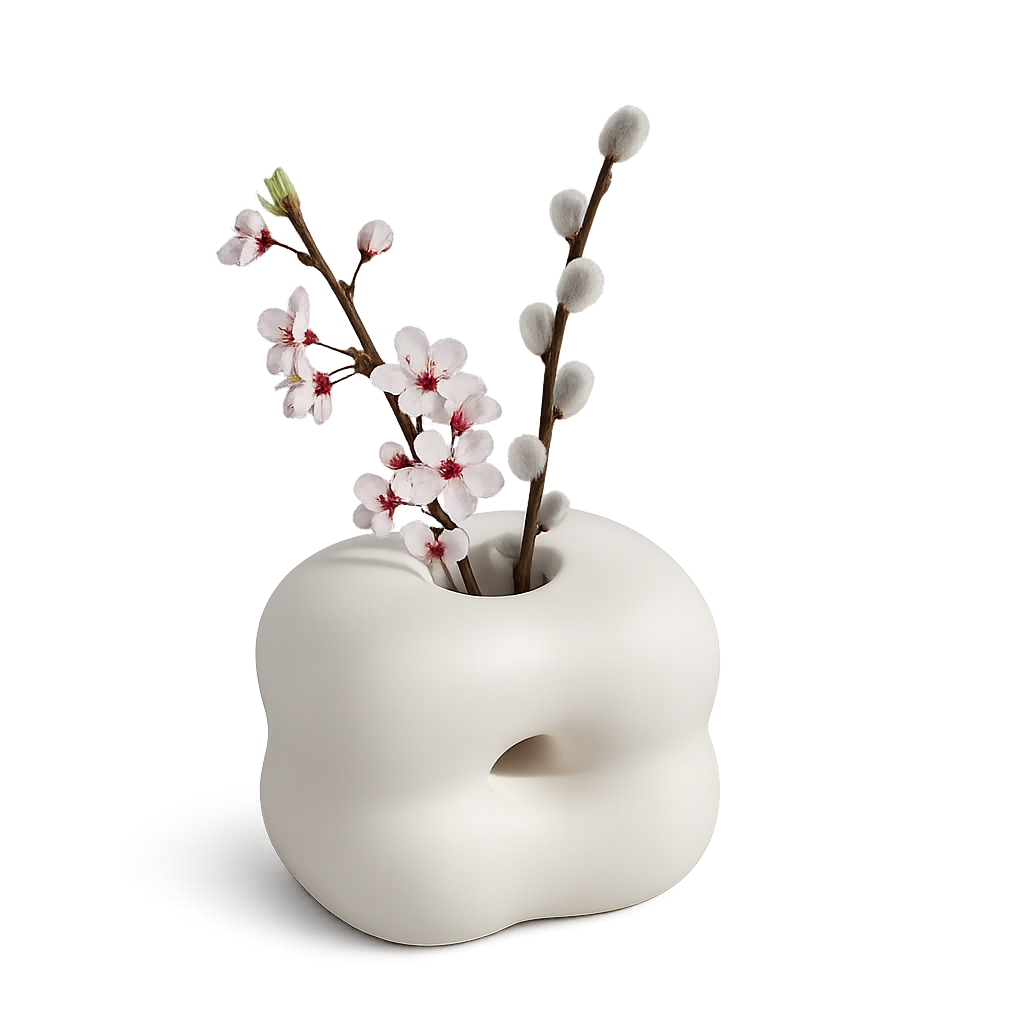
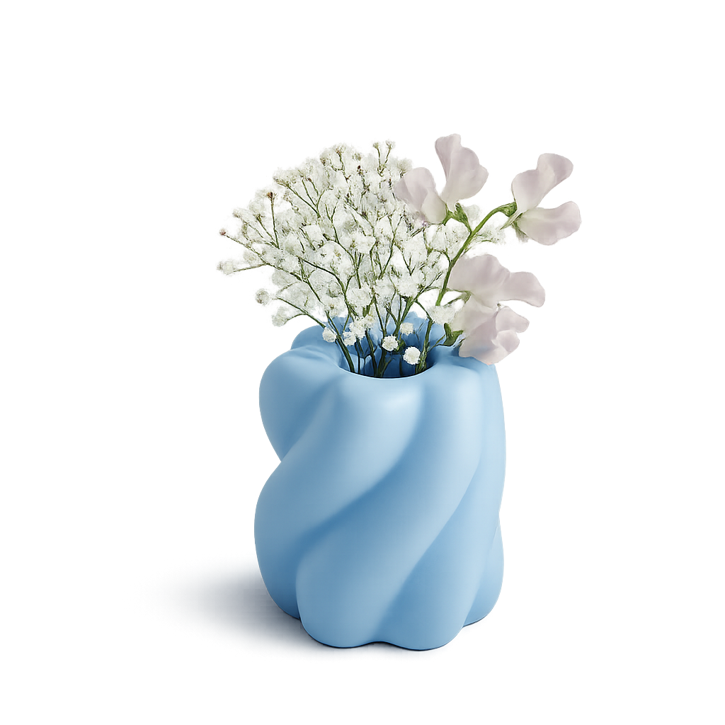
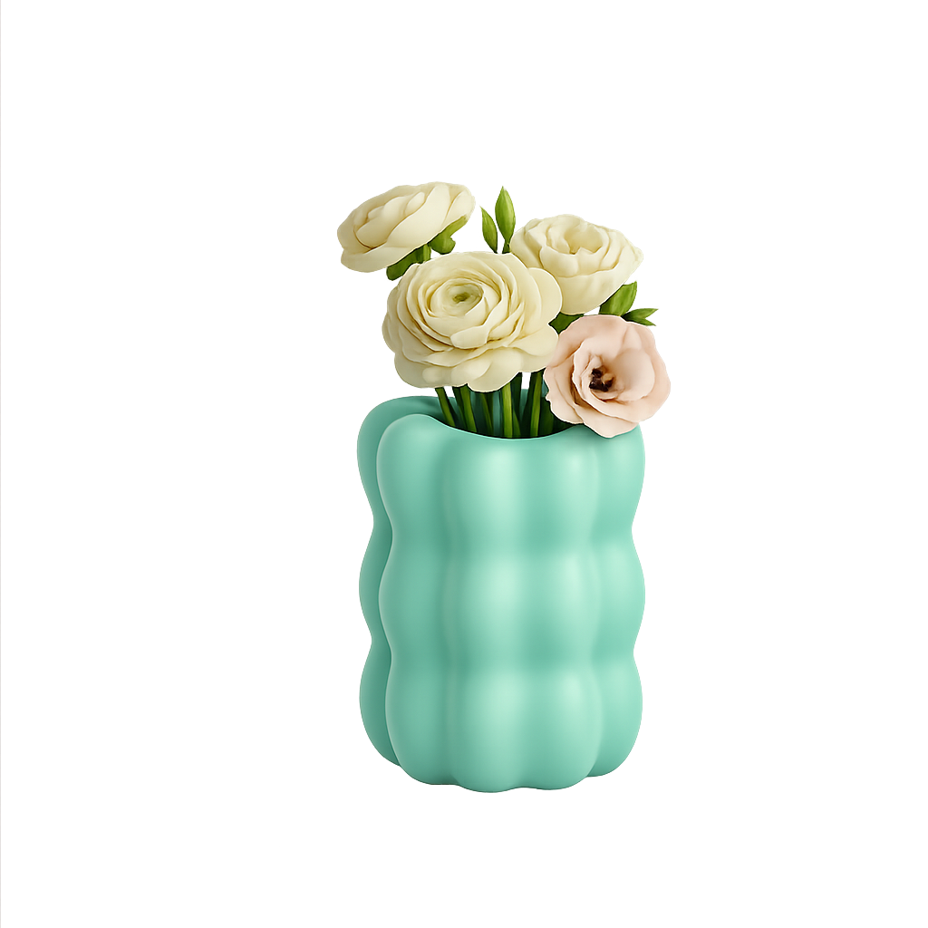
A soft object study for an unbreakable silicone flower vase system — tactile, warm, and built around the feeling of a marshmallow.
A soft object study for an unbreakable silicone flower vase system — tactile, warm, and built around the feeling of a marshmallow.
Mallow is a solo speculative brand project. The insight was simple: every flower vase is fragile. Glass, ceramic, porcelain — drop one and it's gone. What if a vase felt like a marshmallow? Soft, unbreakable, designed to be touched.
The brand needed to carry that material softness through every touchpoint — from typography to color palette to the way the packaging feels in your hands.
The Mallow wordmark uses Fraunces at SOFT 100 — a variable serif whose letterforms physically round at maximum softness, echoing the product's silicone body. Tight tracking keeps it editorial; the softness keeps it approachable.
Six tones drawn from the tactile world Mallow inhabits — dried flowers, bone china, matte silicone, and well-worn wood. Hover to expand.
Two typefaces — one does the feeling, one does the work.
Mallow was fully self-directed — no client, no external brief. Every decision had to come from genuine conviction. It forced me to develop a real point of view and hold it through every execution.
The material insight came first. Everything else followed — typography is soft because the product is soft, the palette is warm because the material is tactile. Consistency isn't a rule you enforce; it's what happens when you actually believe in the idea.